Ashby Design an API for a React Component Challenge
Last updated November 20, 2020
In this interview, we'd like to design an API for a React component (or a set of components) that enables developers to create different permutations of a dropdown and autocomplete.
Why Are We Doing This?
We want to learn how you approach ambiguous design system problems that don't have obvious solutions in the industry today. In particular, we want to see how you approach balancing flexibility and customization for Frontend Engineers with simplicity and ease-of-use for folks that have less React and frontend experience (e.g., Full-Stack Engineers).
Take-home or Live
We provide both a take-home and a live-over-Zoom option for this challenge. We don't have a preference for what you choose; pick whatever is convenient for you!
Live (1 hour 15 minutes)
We'll talk through the challenge in person and document decisions. You'll lead, and we'll ask questions to clarify details and understand your tradeoffs. How you communicate is up to you (we'll use a collaborative markdown editor to write). We ask that you read this document before we meet. We'll reserve 15 minutes at the end for you to ask questions about Ashby.
Take-home (1 hour 30 minutes + 30 minute discussion)
We'd like you to write a document defining your approach to solving this problem. At minimum, we want to know the API (e.g., components, props, example JSX), any libraries you're taking inspiration from, the tradeoffs of your decisions, and any behavior or implementation details that might not be obvious from the API (e.g., you're using a context to pass down information versus through props). The document should be in a format that we can view easily from a browser (e.g., Markdown, Google Docs, Notion).
Other things to keep in mind:
- We expect you to return this within a week after you start. We understand that life can get in the way; just let us know if you need more time.
- We're happy to answer any questions anytime async or over a call!
- Spend around 1.5 hours on it (including asking us questions!). If you want to spend less that's fine. If you want to spend more that's fine as well, but spend it thinking not writing pages of text or expanding scope significantly. We like succinct submissions (which mirrors how we write internally).
Since the live option allows you time to ask questions about Ashby, your hiring manager is happy to book the same amount of time after you submit. Just ask!
Goal
At the end of this interview or the final take-home document, you should have defined enough of the API such that we can see how all the permutations outlined below could be built in JSX. Point out any accessibility considerations and how they could be implemented if not obvious.
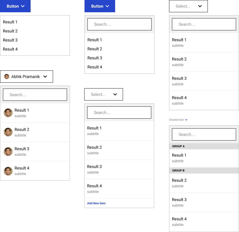
The features we'd like to support:
- The trigger for the dropdown can be a button, a select box, or custom content. The trigger should not allow the user to input a search string.
- The popover can contain:
- A search bar (optional)
- A list of results with custom content
- Headers for groups of results (optional)
- A control to add a new item (optional)
Here's a set of visual examples that cover the features (but not all permutations of those features):
Instructions
Predefined Components
We've already defined some components for you. You don't have to use them, and we don't expect you to:
<ChevronSvg>- It displays the chevron icon used above and can accept any<svg>attribute as a prop exceptchildren<Button>- It provides default button styling, can accept any<button>attribute as a prop (including children)<TextInput>- It provides default styling for a text input and can accept any<input>attribute as a prop (except type)
Constraints
- Assume results will be available as an array in memory. Where they come from and how they're calculated should be irrelevant to your API.
- For autocompletes, assume the results will change based on a search string. Your component(s) should allow the end-user to input the search string and the developer to get the search string as the end-user types (for example, via an onSearchTermChange handler).
We don’t expect (nor necessarily want) working code but we want to see pseudo-JSX to help understand usage of the component(s) in your API. An example for an imaginary modal:
1// Developers need to specify when the modal is open or not. When `doesDismiss...`
2// is true, clicking outside the modal chrome will dismiss the modal
3<Modal isOpen={boolean} doesDismissOnClickOutside={boolean?}>
4    // When onDismiss is provided, an x is placed in the right corner
5    // and when clicked calls onDismiss
6    <ModalHeader onDismiss={() => void}>
7        // Optional icon. You can pass a React component type that renders an icon
8        <ModalIcon icon={ReactComponentType}>
9        <ModalTitle>
10          // Anything can go here, but usually text
11        </ModalTitle>
12    </ModalHeader>
13    <ModalBody>
14        // Anything can go here
15    </ModalBody>
16    <ModalFooter>
17      // Evenly spaces children and aligns them according to the component name
18      <RightAlign|LeftAlign|CenterAlign>
19        // Anything can go here, usually <Button>s
20      </RightAlign|LeftAlign|CenterAlign>
21    </ModalFooter>
22</Modal>
Pseudo-JSX is a construct we've come up with to separate API design from actual implementation. We've written a primer here to help you understand what we're looking for in the interview.
You can also define custom hooks or HOCs as part of your API.
What Does Excellent Look Like?
We like to be upfront about what excellent looks like — in doing so, we get the chance to see what you're capable of at your best.
Think about what kind of engineers will use this component and their needs. Empathize with them! Some folks will have strong frontend experience and some will not.
Excellent writeups or live sessions:
- Address all the requirements
- State assumptions made
- Focus on explaining why the design is like it is
- Don't follow industry trends blindly. You should defend your decisions with principled thinking and empathy for the end-users
- Are succinct and easy to read. Strong submissions are often under 2 pages. In particular, don't state obvious things
Also, remember that it's an interview, and you have less time than you'd have in a typical work environment. Cover the essential requirements and be intentional about where you go above and beyond.