Hiring Excellence | A Recruiting Operations Guide to Establishing And Communicating With Metrics Before You Have Internal Baselines

14 minute read
TL; DR: This article aims to help teams who are getting started with official metric tracking. It first defines the metrics we believe you should focus on, and then establishes a process for collecting baselines (and setting goals), and how to communicate these insights to hiring managers and leadership.
Talking about data and metrics
One of the core pillars of Recruiting Operations (RecOps) is data/analytics/reporting. Unlike other pillars (programs, operations, and strategy), data forms the foundation of decision-making. Here are a few big things to remember when reading this article:
-
Data comes in many forms.
-
Data is not just numbers.
-
Not all data is good data (also known as “Bad data in, bad data out”).
-
Data is a means of telling a story.
-
Understanding why someone asks for data is as important as knowing how to pull it.
Your ability to use data effectively to inform your TA Leadership team and other decision-makers will make you more of a strategic partner and help you grow in your RecOps career. The key will be how to approach those conversations.
In this article, we will go over the following:
-
Data Literacy - A Crash Course
-
TA Data Stakeholders
-
How to Approach Data Conversations
-
How to Present Data
-
How to Start Building Recruiting Metric Targets with No Baseline
-
The Data Skills Starter Pack
-
Additional Data Resources
-
Best Practice Recommendations
Data Literacy - A Crash Course
To be effective with data, you need to develop a knowledge of data. If you already have some knowledge of data, feel free to skip over this section, as you probably already understand these core principles and different forms of analysis.
When talking about data, many terms get used interchangeably. However, it is important to understand their differences. For example, there is a difference between data, analytics, and reporting. That is what they mean:
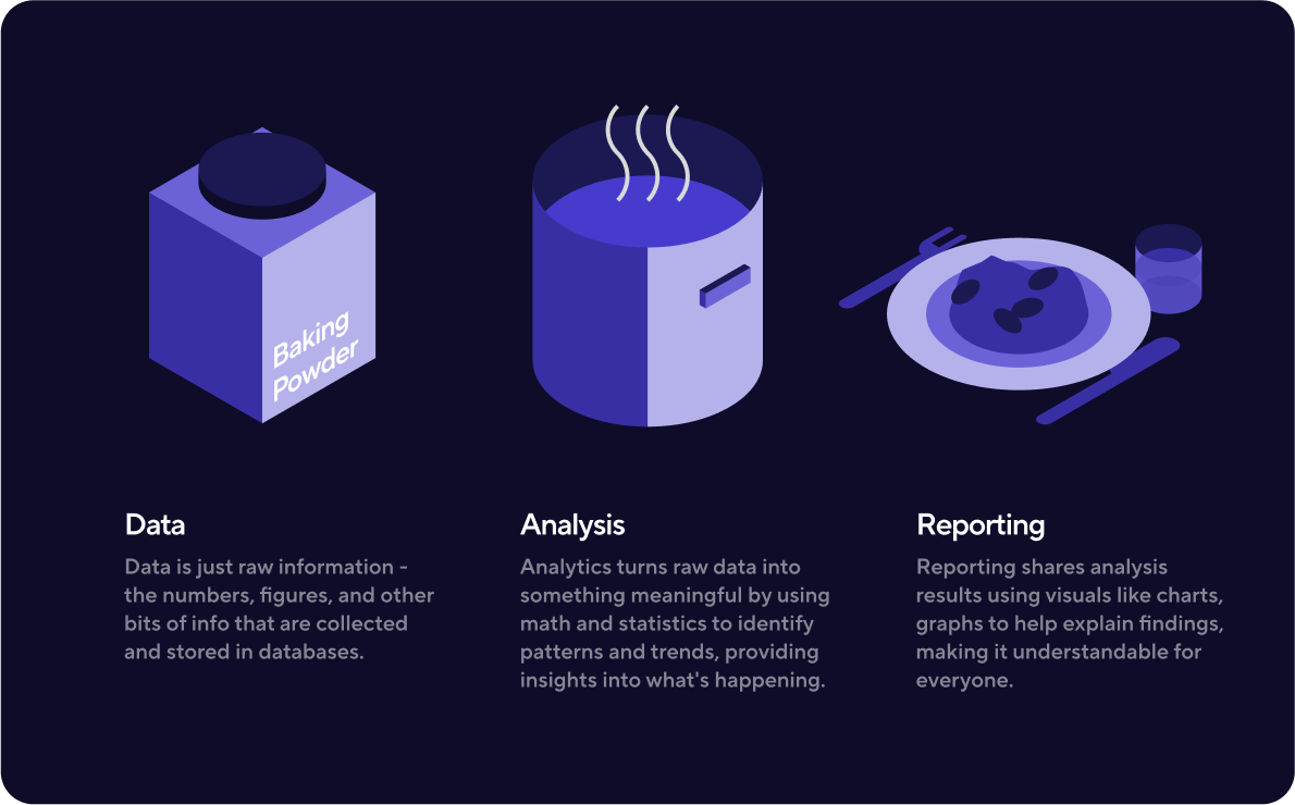
Data is just raw information - the numbers, figures, and other bits of info that are collected and stored in databases.
Analysis is taking raw data and turning it into something meaningful. Analysis uses math and statistics to identify patterns and trends in the data, so you can learn more about what's happening.
Reporting is all about sharing the results of your analysis with other people. Reporting can involve making charts, graphs, or other visuals to help explain your findings so everyone can understand what's happening.
For a quick visualization: data is the raw ingredients, analysis is the cooking process, and reporting is the meal you serve up at the end.
Going further down the data rabbit hole, you have:
Qualitative data - This data is descriptive and based on characteristics. Think colors, tastes, and opinions.
Quantitative data - This data is numerical and based on measurements or quantities. Think height, temperature, and the number of things.
Within each of these two types, there are more specific types of data, such as:
-
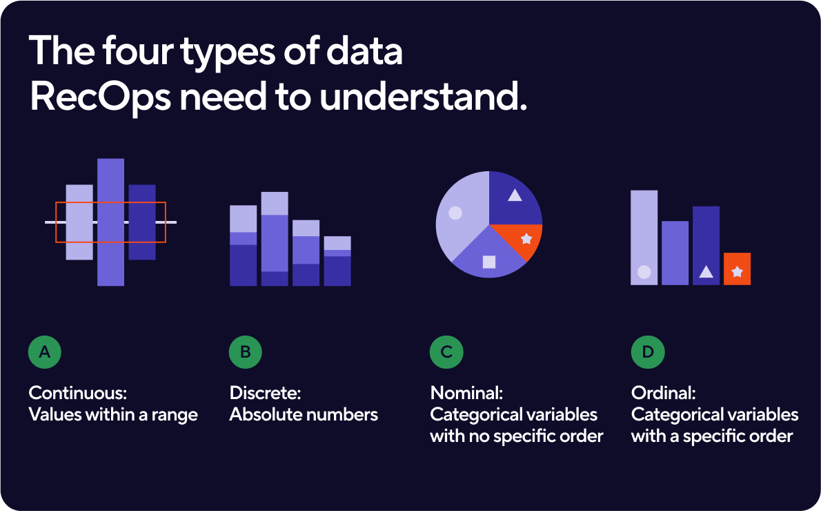
Continuous: Takes any value within a range. Examples include: height, weight, temperature, and time.
-
Discrete: Consists of whole numbers, often used for counting or measuring. Examples include: the number of students in a class, the number of eggs in a carton, or the number of items sold in a store.
-
Nominal: Consists of categorical variables with no specific order. Examples include: colors, gender, and occupation.
-
Ordinal: Consists of categorical variables that have a specific order. Examples include: the rating of a movie, the level of education, or a team's position in a sports league.
Knowing what type of data you're working with helps you choose the right analysis techniques for your project. Speaking of analysis, here are several to be aware of:
-
Descriptive: summarizes data, like finding averages and other main features.
-
Diagnostic: figures out why certain patterns or trends are happening in the data.
-
Predictive: uses historical data to make predictions.
-
Prescriptive: help decision-makers choose the best course of action based on the available data.
-
Exploratory: finds patterns and relationships in the data that weren't known before, to guide further analysis.
When used properly together, these techniques help people better understand data and make informed decisions based on it.
TA Data Stakeholders
-
C-Suite
-
Department Heads/Business Leads
-
Finance, Planning, and Analysis (FP&A)
-
Hiring Managers
-
Recruiters
When providing data to each group above, what you present and how you do it will be different. For example, individuals in the C-Suite are more likely to want charts that give information quickly and are easy to understand (e.g., bar graphs and line charts). In presentations, they may want you to remain high-level in the information you provide. However, FP&A and Business Leads will want the opposite, needing broken down tables and into the weed analysis. When thinking about what and how to communicate data with leadership, always take a step back and think about what decisions they need to be able to make with the data and what will best help them make those decisions. Starting here will enable more strategic conversations and better informed and faster decisions.
How to Approach Data Conversations
All data conversations, whether direct or inferred, anchor on ‘why’. Like a detective, your goal should be to uncover why that ‘why’ is being asked. The reason for uncovering this will:
-
Help you determine what kind of data you are looking for.
-
Help you determine what type of analysis to use.
-
Who the audience for your data will be.
-
How that data should be displayed.
-
How to craft your data story.
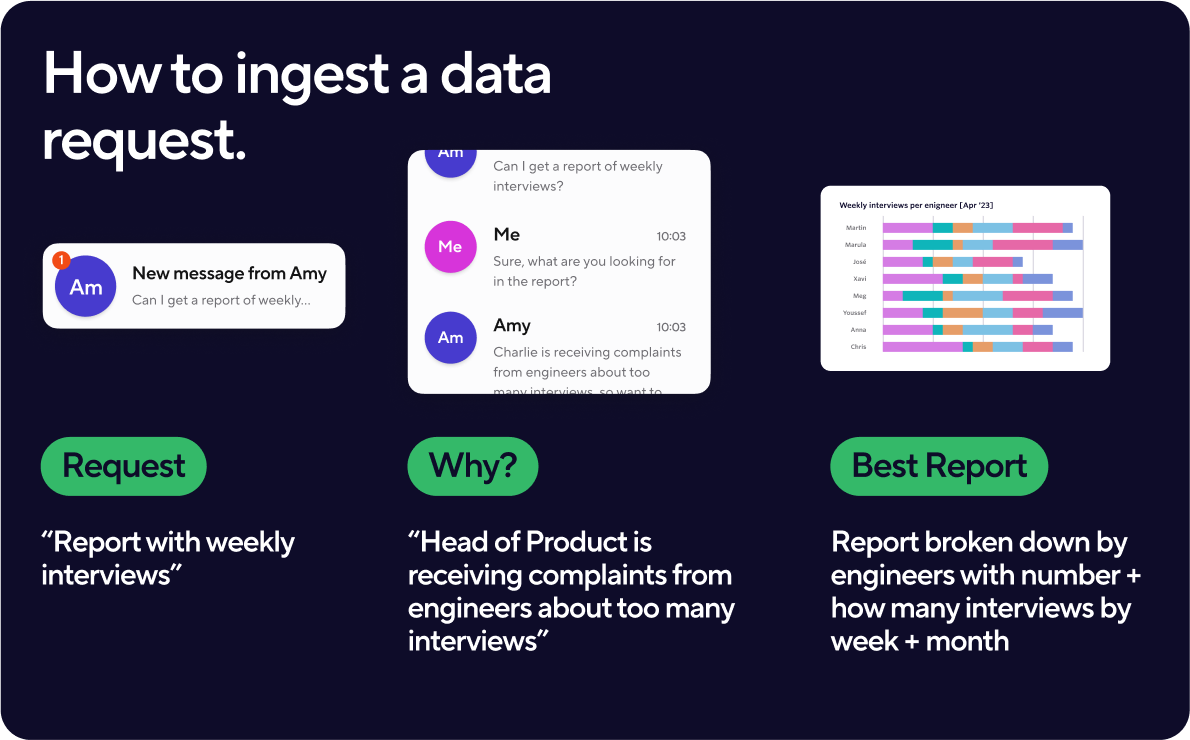
Let's use the following example to illustrate the points above. The Head of TA comes to you asking for a report about the number of weekly interviews. Based on the request, you know that you are looking for quantitative data that is also discrete and descriptive. You’re likely to display the data in a line or bar graph followed by the story of the number of interviews. This may be a simple request, so you don’t ask why. The next day, however, the Head of TA has a new request and asks for it to be broken down by role and recruiter. Now, you have to pull a different type of report and produce the information in a data table. You’ve now done two reports, in two days, for the same audience.
You’re doing extra work because you never asked the Head of TA their ‘why’ and they have to wait longer for the answer they need. By asking the ‘why’ question, you uncover details that provide purpose to your data and give you a starting point to using it strategically. Using the same example, by getting more background details, you learn that the initial request came from a conversation between the Head of TA and the Head of Engineering. In that conversation, the Head of Engineering told the Head of TA that they are receiving complaints from their engineers too many interviews are happening and it is creating a backlog. This completely changes everything because now you know the purpose for the data, which is to prove whether or not the quantitative data backs up the qualitative data. Based on this, you can now report on a specific department (Engineering), break the numbers down by team and interviewer, and then provide insights into whether or not what the Head of Engineering is hearing is true. Additionally, you can then use this data to go back and evaluate your processes (e.g., have we asked interviewers what their max number of interviews per week is, are we rotating interviewers enough, and so on). This use of data informs better process.
How do you present the data?
Data and information mean different things to different groups of people. Have you ever been on a publicly traded company’s investor call and immediately been lost because it is pure numbers and confusing terminology? This call is for a specific type of audience, and the information is also tailored to that group. Knowing your audience when sharing data helps determine the type of data to bring, the story to tell, the words you use, and the types of questions to anticipate.
For example, say you are presenting a department update to the C-Suite. To them, diving into the weeds and discussing decline/reschedule rates (unless truly worrisome) isn’t the best use of their time. However, presenting the same information to recruiters becomes extremely important because it could signal a need to change talk tracks.
Building off that example, how you share the data visually is important. You might want to create a deck with simple charts on each slide for the C-Suite since this won’t distract from your content. For your recruiting team, however, you might want a dashboard that everyone can consistently view that is up-to-date in as close to real-time as possible.
As you dig deeper into the data, you will start to see fewer numbers and more stories and trends. When you start to see the stories and trends you will naturally want to take a deeper dive into the data. When this happens, it is important to always keep the acronym KISS in your head. KISS stands for Keep It Simple Silly (or Stupid). If you ever find yourself trailing or adding more details to a report than helpful, take a small break, and KISS it when you return.
Shifting from the theoretical to the practical, as a shortcut to thinking about how to present data I suggest using:
-
Bar charts are useful when you want to compare different categories or groups of data. They are particularly helpful when you have discrete or categorical data, such as nominal or ordinal data, and want to show the frequency or distribution of each category. They are easily read and interpreted by a wide range of audiences and can effectively highlight differences between categories. Additionally, they can be used to display trends over time, such as with a stacked bar chart or a grouped bar chart. Because of their versatility they are especially helpful for leadership groups and below.
-
Pie charts are useful when you want to show the proportion of different categories or parts that make up a whole. They are best suited for situations where you have a small number of categories, usually not more than six, and want to show how each category contributes to the total. However, it's important to note that pie charts can sometimes be misleading if the slices are not accurately sized or if there are too many categories to display. In such cases, a bar chart or other visualization might be a better option.
-
Tables with conditional formatting can be used to display data when you want to highlight specific values or patterns within the data. Conditional formatting allows you to automatically apply formatting, such as font color or background shading, to cells based on certain criteria. Tables with conditional formatting can be particularly useful when working with large datasets, as they allow you to quickly identify important information without having to manually scan through every cell in the table. They can also be useful for creating visualizations that are easy to read and interpret, especially when combined with other types of charts or graphs.
How Ashby Supports This
Unlike other ATS’, that require exporting your data to share and visualize it, Ashby offers both default and fully customizable dashboards within the product. The default dashboards offer pre-built reports for communicating core insights across your jobs data. The customizable dashboards take it to the next level by offering a template library that helps you build and maintain real-time looks and visualizations. These elements can be downloaded and shared in a single click as well as specifically shared to targeted groups.
How to start building recruiting metric targets with no baseline
If you are the first RecOps person to join a company, one of the first expectations is that you will start to make recruiting more data-driven. If this is your first time, it can feel daunting. Where do you go for information and guidance? Where do you find benchmark data and how does your data compare to those companies? After you take a deep breath, you will find that the answer is often not as complicated as the question.
First, come to terms with the fact that the requests for your data, how it is displayed, and how it will be interpreted will evolve over time. One of the first dashboards you can build for different groups will generally show the following information:
-
Time to Fill (per role and total)
-
Time to Hire (per role and total)
-
Offer Acceptance Rate
-
Funnel Metrics (# of candidates in each stage)
Many ATS will offer these as generic reports so minimal customization will be necessary but you may need to export these reports into a different location (like a Google Sheet or Excel Workbook) based on your stakeholder’s preference.
However, as the company grows, so too will the complexity for your data. As this complexity grows, you may be asked to look for a data visualization tool (cough cough Ashby cough cough) or need to build one yourself (in Tableau, Google Data Studio/Looker, PowerBi, and so on). These reports might start to look like:
C-Suite and Business Leads
-
Progress to goal
-
Pipeline
-
DEIB (top level)
-
Offer acceptance rate
-
Any major anomalies
Hiring Manager
-
Sourced candidates
-
Pipeline pass through rate
-
DEIB of sourced candidates
-
Candidate survey feedback
Recruiting Team
-
Candidate/Interview Team Cancellation/Reschedule Rates
-
Rejection Reasons
-
Recruiting's Impact on the Broader Company
How Ashby Supports This
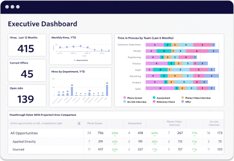
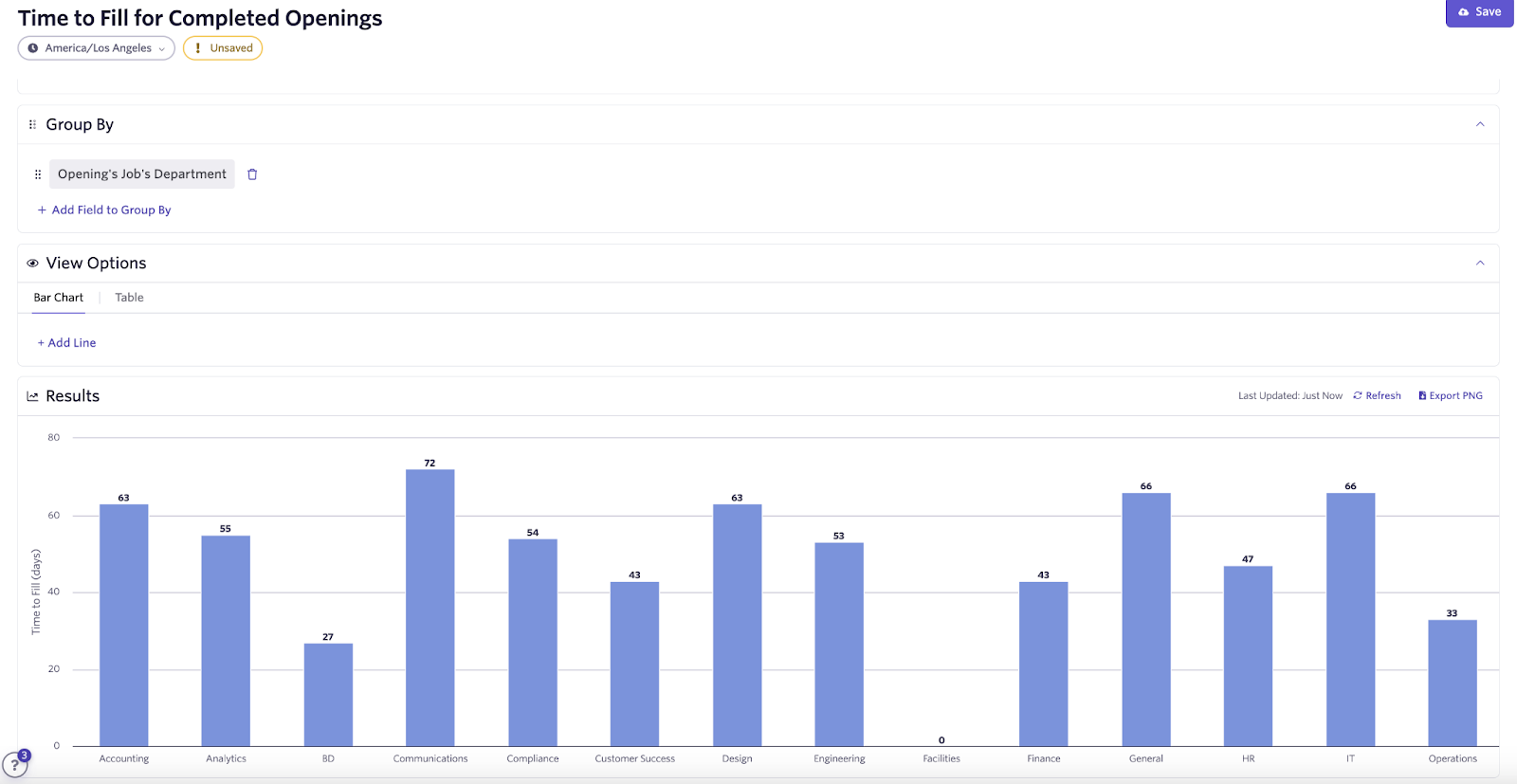
In addition to offering build-from-scratch reporting, Ashby also offers templated reports for common recruiting metrics such as Time to Fill, Time to Hire, Offer Acceptance rate, and much more. The templates are fully customizable both by filtering in or out specific groups (worker types, departments, etc.) as well as capable of grouping by a field of interest. For example, you may want to look at time to fill, but see each department separately/comparatively on the report. This flexibility allows talent teams to build and customize template and build-from-scratch reports for unique audiences in their organization, as it is commonly the case that different areas and levels of the business have different reporting needs/asks.
Here's an example report for time-to-fill by department:
The Data Starter Pack
While it is possible to go through your RecOps career without ever having to build or clean data, it is highly unlikely. To get started here I recommend familiarizing yourself with good process around data and the following:
Because of that, it is important to train yourself in the following:
-
Google Sheets/Excel
-
We’ve built a list of functions and formulas to help get you started (Link to Snippet)
-
A firm understanding of your applicant tracking system (ATS) and how it houses data
-
It is important to know what happens to your data once you make changes. While many ATS’ are straightforward, they all have certain fields or information that are not reportable, can’t be changed, or will need to remain a specific way for reporting. By having a firm understanding, you will prevent possible issues that can appear in the data later.
-
Survey Tools and Techniques
-
Survey data, especially when you can get it from your internal and external stakeholders, is important. Often this can help you make a switch from qualitative to quantitative data.
-
Surveys traditionally have a low response rate if certain conditions aren’t met. People will not respond if it is sent at an inconvenient time or if they don’t feel they have psychological safety.
-
Optional but helpful the bigger your data sets get
-
A data language like Python, SQL, R, JavaScript
-
AppScripting or VBA
Best Practice Recommendations
Ironically, despite dealing with data and analysis, very few RecOps professionals build a means to track their reporting. This is a huge loss as not all reports take the same amount of time depending on your ATS or stakeholder (i.e., HR, Finance, etc). Because of that, we recommend automating data/reporting requests into a ticketing system. To the requestor, you should ask the following questions:
-
The question
-
Urgency
-
Stakeholders involved
-
Background information for the request
-
Frequency (e.g., is this a one-off or will it be a recurring)
On the back end, you should track:
-
How long it took you to complete the report
-
Where the data came from
-
Number of requests by requestors
By tracking these pieces of data, you will have diagnostic and predictive data. These will help you to give accurate estimates to your stakeholders whenever a request comes instead of a vague answer.
Making it all actionable
Data is a crucial aspect of Recruiting Operations (RecOps), forming the foundation of decision-making. It is essential to develop a knowledge of data and understand the differences between data, analytics, and reporting to be an effective member of a TA Leadership team.
Knowing what type of data you're working with can help you choose the right analysis techniques for your project, and data analysis techniques can be used together to help people better understand data and make decisions based on it. Furthermore, it's important to approach data conversations with the mindset of a detective and uncover the "why" behind data requests to make data actionable.
By following the tips and strategies outlined in this article, you can become a strategic partner in your TA Leadership team and use data effectively to inform decision-making.
Additional Data Resources
We’re giving you this list of resources you can use to grow your own data knowledge, or find information for your stakeholders. Enjoy!
Books:
-
How Charts Lie: Getting Smarter about Visual Information by Alberto Cairo
-
Effective Data Storytelling: How to Drive Change with Data, Narrative and Visuals by Brent Dykes
Websites:
Excel/Google Sheets Learning:
Metrics to Track:
Reporting:
Jeremy Lyons is an Expert-in-Residence here at Ashby. He has been in the global Recruiting Operations space for 6+ years, from start-ups to Fortune 500. He contributes RecOps thought leadership to Ashby and Eqtble. His work can be found on RecOps Collective, Medium, Substack, LinkedIn, and The RecOps RoundUp.
Subscribe to Updates
Ashby products are trusted by recruiting teams at fast growing companies.